Warner Bros. vs Disney-two paths of animation

Before I start on how animation studios Warne Bros. and Disney developed individually and together, greatly influencing each other, I need to briefly mention the complete beginnings of Animation. First someone had to realise that succession of photos will create a motion, and it happened in 1824-Peter Roget ‘Persistence of Vision’ theory.In 1831  phenakitstoscope was constructed.

In 1872 Edward Muybridge to prove that the horse while galloping at some point doesn’t touch the ground started experimenting with photographing animal and later people in motion.  in 1899 Thomas Edison created kinetoscope which projected a 50ft length of film in approximately 13 seconds.in 1895 Louis and Augustine Lumiere issued a patent for a device called a cinematograph capable of projecting moving pictures.Following these inventions first experimental animations were made:

Stuart Blackton(1906) 

Emile Cohl (1910) 

Winsor McCay(1911)

It’s no secret that Warner Bros was at first heavily influenced by Disney Studio. Warner Bros wanted to create a competition for Disney, but along the way the studio created it’s own style that was a great addition in a marketplace. Looney Tunes and Merry Melodies with it’s new wacky,zany style at some point won over the worldwide audience. But what exactly was the different between studios cartoons? I took a better look at some early short cartoons on You Tube. First thing that comes to mind when you watch Warner Bros. cartoons is how the humor is delivered- very fast-paced. It gets pretty violent as well, but of course in a humorist manner. The cartoons are constantly running on gags.  Then I took a look at early Disney cartoons. Their humor was much more slow-paced. And Mickey Mouse wasn’t in life threatening trouble all the time. He didn’t have to worry about being hit,smacked, shot,kicked,blown up which usually is a main theme in Warner cartoons.Plus Disney cartoons usually have a pretty decent plot ,whereas Loony Tunes do as well but it seems to be of a less importance than actual gags.

What’s also different is the approach of the environment in both studios. Background in Loony Tunes is flat and adds no depth to the cartoon. It has no other role than just a simplified creation of a place that gags are taking place. Where surroundings in Disney got a bigger role in creating the mood, and navigating the spectator what could happen, what emotion should we feel at the right moment: fear, happiness? Disney was the only studio that used perspective and illusion of depth to such extend.

The characters’ social spheres are different as well. Loony Tunes world was proper  amount of crazy, it was some highly unrealistic world. With Disney quite the opposite. Watching or reading stories of Mickey Mouse and Donald Duck even since childhood were giving me an impression of real world.  Mostly i remember the impression of middle class suburbia from the 50’s.

When i think of my childhood i surprisingly remember enjoying Warner Bros. cartoons much more than Disney cartoons and following feature animations like Snow White, Pinocchio. Why, when i think of old-school  Disney i associate it with an uneasy dark feeling? Maybe Warner Bros with its hyper- violence, should have left a stronger memory. But that was the problem for me with Disney when i was a child. Maybe it’s real and raw variety of good and bad emotions was too close to the real life.

Medical Art

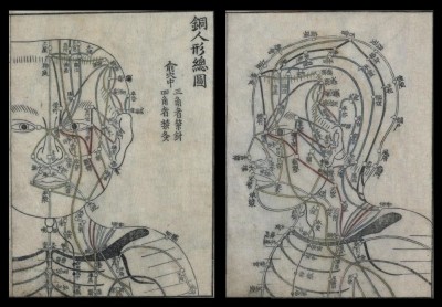
Acupuncture chart from Hua Shou (fl. 1340s, Ming Dynasty)

14f801c2361f370e9617eb0829fa7723

kotsudoseigozusets 1744

15th Century- Printing press distribution

ppress

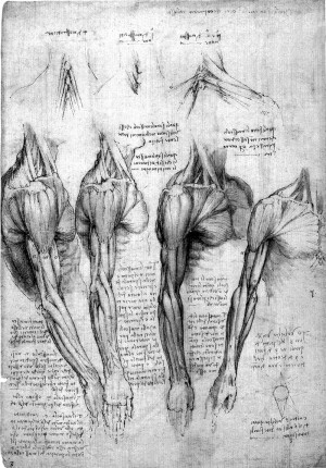
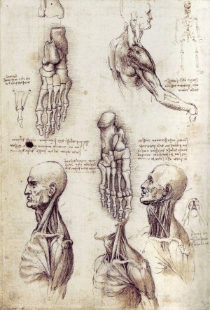
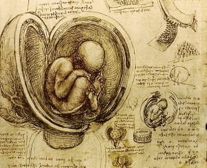
1452-1519- Leonardo Da Vinci

leonardo-da-vinci-arm-1shoulderandneck2fetus davinci

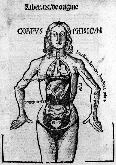
Gregor Reisch, from: Margarita philosophica, circa 1503

3f1004870fc48c1c8ef06857f95f5830

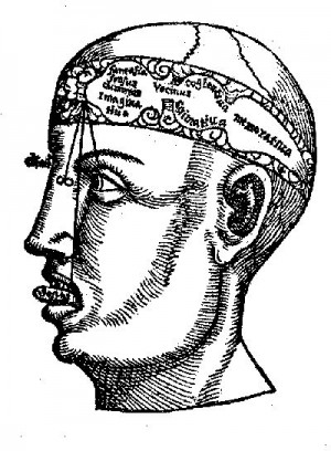
The Medieval and Renaissance Brain. Version of a diagram by Gregor Reisch, first published in 1503.

cfdbbed0b5418182738f93e161df8129

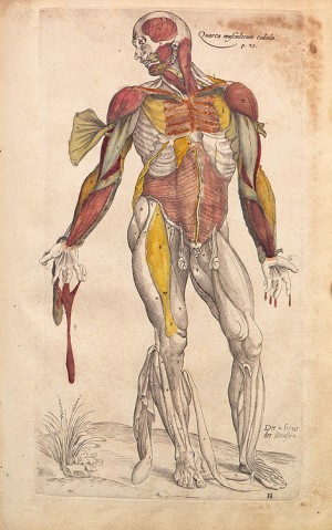
Andreas Vesalius (1514 – 1564) was a Flemish anatomist and author of one of the most influential books on human anatomy,

vesalius04sm

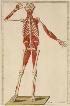
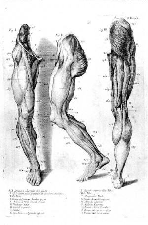
1500-1574-Romanae archetypae tabulae anatomicae novis… Rome, 1783. Hand colored copperplate engraving. National Library of Medicine. While contemporaries praised Eustachi’s anatomy for its accuracy, his plates do not depict any specific dissection. The figures are posed to entertain and divert the reader as well as to instruct.

52a6c1d16a01274bf421c057a82a1520

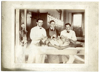
Cadaver dissection since 17th century

cadaver

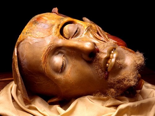
Wax Anatomical Model by Gaetano Giulio Zumbo, 17th Century

ca9f7d32ae2046c4be63dabb04bc2385

18th century William Cowper

6e4e863ae089337d5db5762ef2a7dab5

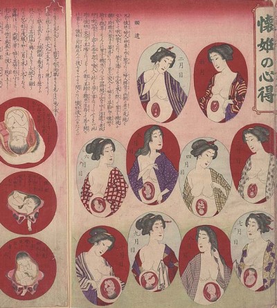
Pregnancy guide — Hamano Teisuke, 1880

medical_print_9

Ephraim McDowell He was the first to successfully remove an ovarian tumor-depiction of surgery 1809

In 1809, 46 year old Jane Todd Crawford rode 60 miles on horseback to see Dr. Ephraim McDowell who removed a 22 lb ovarian tumor through a 9″ incision in 25 minutes (before anesthesia and antiseptic). Within a few weeks she got back on the horse, rode home, and lived another 22 years.

jane

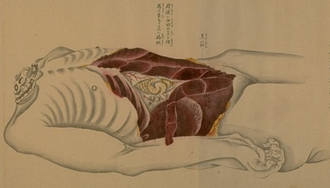
Kaibo Zonshinzu anatomical scrolls – 1819

anatomical_scroll_7kaibo-zonshinzu-anatomy-scrolls

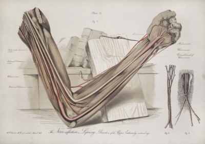
Henry Vandyke Carter- grey’s anatomy 1856-7

downloadThe_effect_of_Leprosey_on_the_arm_nerve_Henry_Vandyke_Carter

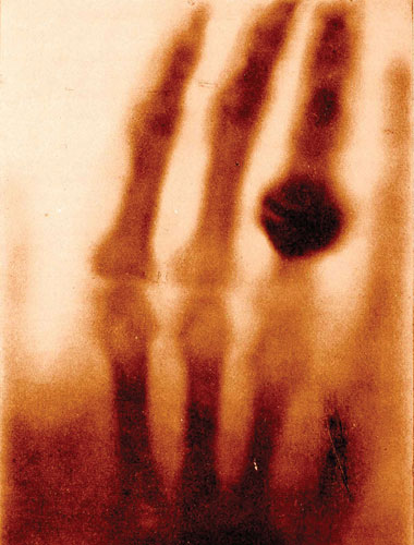
1895-X-ray discovered

07_11_Foundations01

Max Brodel 1890s

7409bea671c9254141c63b06314971b2

Frank Netter- 1936

illustrations by Frank Netter, scanned from Clinical Symposia, Volume 16, Number 3, July-August-September, 1964. See this earlier post for more.

5b6adeb69a8ccb778acd95ad6465188e

Karl wesker- thieme atlas

24882494c1d85b751f1fdd1cf979b233

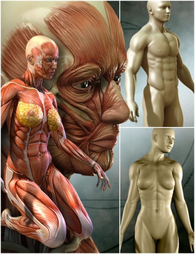
3D

MedicalMuscles

Interactive Medical Art

gi_interactive_montage2

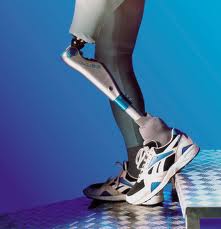
Prosthethics

download (1)

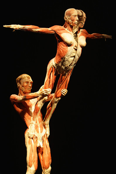
Gunter Von Hagen’s Bodyworld

body-worlds51download (2)

Last Supper in Christian Art

last-supper_da-vinci

The Last Supper has been a common topic in Christian art. Very first picturing
of that scene can be seen in the Catacombs of Rome. When artists of
Byzanthium would frequently focus on the apostles receiving communion, in
Renaissance Last Supper itself happens to be a leading subject. Three most
common themes, we could easily notice when analyzing theme, were of
Eucharist tradition, of Jesus announcing his betrayal and him farewelling where
Judas is no longer present. Leonardo Da Vinci painted his version on a church
wall but without a proper preparation so the piece of art starded disappearing
just years after it was finished. Santa Maria Church was partially destroyed
during the World War II, luckily the wall has not suffered much from bombing.
This painting portrays most likely a second version of Last Supper depicingbetrayal.
A knife in one of the apostols hand might support this theory. Some
art critics believe it’s Maria Magdalena on the right hand side of Jesus as the
figure seems delicate, with feminine features and her clothing differs. The
painting is full of dynamic and beautifully chosen colour scheme. Da Vinci has
not painted Last Supper in a straight forward way so we have a chance too look
for alegories within it, analize and interpret every single detail.

Russian Beauty- Typography and propaganda

tumblr_mi82j4qD1p1rt3qpso1_1280

As the Soviet Union was in its formative stage after Bolsheviks overthrew the last Czar in 1918, a new politically focused art and design movement began. And it was called Suprematism- use of abstract geometric shapes, bold rules, and text set at right angles. Not far from his successor Constructivism which was developed after WWI in Soviet Union. Artist highly inspired by patriotism and believing in Communism decided to help bring social order in their country.

The purpose of communist propaganda was for the Communist party to connect with working class and market their ideas directly to people. And how can you best get to uneducated people? By simplifying the message as much as possible. Punchy and short line would be memorized better then some long essay.That’s why Soviet Constructivism posters were truly revolutionary.

So there were few parts that together created the most convincing Soviet propaganda poster:

– Main motive on the poster: the people, always the people, working class. That’s what Communism is about, at least in theory. And that’s what the Soviet party wanted people to believe. That shared goods is best goods. That people together, not individually work and live most efficiently.

-Simplified forms- the poster need to show the most generalized image of the working class.

– red and White-White is the color of the background while red is the main printed color.

But what i really wanted to mention was typography in those posters. Always, clearly visible letters, short message. Obviously Russians use Cyrillic Alphabet unlike most of the European countries so i suspect that to us the typography is even more exotic, more foreign. Sans serif typeface ,Rejects all forms of ornament other than squares, circles and triangles.so to sum up the Essence of this typography was clarity.

I personally think that typography, the whole layout of Soviet propaganda posters is beautiful. Also the whole impression of the power of the people, a nation  is working on me.So i  think that back then, i could have been taken with its message about Communism being the right choice for the country, if i were just a simple, uneducated person. So aside the Communist message, i think that precursors of the Constuctivism did the remarkable job. They created one of the most successful propaganda typography in a history.

SEMIOTICS

SEMIOTICS

Signs. How their meaning is formed?We all interpret a sign,then we draw on cultural or personal experience to understand a sign. Semiotics is about communication.

Types of signs:

Icon- Signify by resemblance, for example a photography, we can recognize the object       Index-Signify by casual relationship.We can recognize the relationship.for example smoke and fire                         Symbol-Signify byconventional or arbitrary relationship.We must learn this relationship, For example a religious symbol

Here are few examples of  the manipulation and hidden agendas behind messages that are part of a process by which signs  are changing to become the signifier of a secondary  meaning. In essence, the material being interpreted loses its original roots to a new connotation:

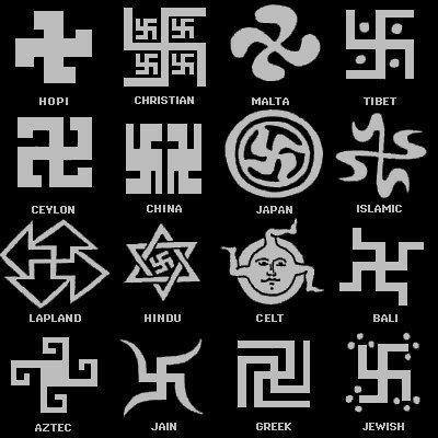
Origins of Swastika:

76c8244db98095bd8b674a7d377acb45

The swastika is an ancient symbol that has been used for over 3,000 years.  Artifacts such as pottery and coins from ancient Troy show that the swastika was a commonly used symbol as far back as 1000 BCE. During the following thousand years, the image of the swastika was used by many cultures around the world, including in China, Japan, India, and southern Europe. Until the Nazis used this symbol, the swastika was meant life, sun, power, strength, and good luck.

300664_672732066076451_840009313_n

Even in the early twentieth century, the swastika was still a symbol with positive connotations. For instance, the swastika was a common decoration that often adorned cigarette cases, postcards, coins, and buildings. During World War I, the swastika could even be found on the shoulder patches of the American 45th Division and on the Finnish air force until after World War II. Because of the Nazis’ flag, the swastika soon became a symbol of hate, antisemitism, violence, death, and murder.These conflicting meanings are causing problems in today’s society. For Buddhists and Hindus, the swastika is a very religious symbol that is commonly used. Where especially in Europe and North America this symbol is only associated with the terror of the Nazi.  It is extremely interesting to look at how dramatically the meaning of signs can be transformed. The fact that a symbol, which was once distinctly positive, can be so severely tainted is remarkable.

Similar situation with a RED STAR:

da03a7a198754145b67df65498f85bdc

The symbol of red star and it’s meaning varies all over the world same as the swastika. If only cover the Europe,The five-pointed red star is often used as a symbol of communism. It is sometimes understood to represent the five fingers of the worker’s hand, as well as the five continents. Across Europe, the symbol is treated very differently in different countries: some have passed laws banning it, claiming that it represents “a totalitarian ideology”, while other countries hold a very positive view of it as a symbol of Anti-fascism and resistance against Nazi occupation.For example

In former Yugoslavia the red star was not considered a communist symbol, as were the hammer and sickle; but as a symbol of resistance against fascist and Nazi occupation and their ethnic policies instead. The red star was worn by Tito’s partisans as an identification symbol, regardless of their worldview including people with a religious background. As the red star spread to communism in the East, it was adapted: while some states kept the star as it was, some used a yellow star, particularly on a red field, with the same symbolism. The Far Eastern Republic used a yellow star on its military uniforms, and the flag of the People’s Republic of China has five yellow stars on a red field. The flag of Vietnam also has a yellow star on a red field. In Brazil, however, the red star remained as it was.Personally I don’t find the red star offensive even though i’m from Poland, and Poland used to be a communist country ( 1945-89 ).while i could understand why people might find the symbol of hammer and sickle more offensive. Even i would feel uncomfortable seeing someone wearing this symbol.


Symbolic Language

1be27afce299a17398d194fe7209ba60


In 21st Century we have few hundred spoken languages if you count the countries, few thousands if you include the dialects. If we include sign languages where some for example African tribes use gesture instead of speech, the number will be even bigger. It is almost impossible to verify how many dialects there are because everyday there is a new language being created and another becoming a dead language. In most cases what makes languages distinct from one another turns out to be much more a social and political issue than a linguistic one- issues of statehood, economics, literary traditions and writing systems, and other trappings of power, authority and culture.But from a biologist’s point of view there is only one language- human language. Because that’s what differs us from other animals- being able to communicate with each other while using spoken and symbolic language.

The birth of Symbolic Language is associated with prehistoric art. First visual languages such as pictographs carved into a stone,stenciling on caves ( early forms of printmaking-Chauvet Cave),Runs( Cuneiform Scripts – Sumerian language) and later Hieroglyphics(very pictorial) were also symbolic languages.   Most of them were impossible to decode. But there are tons of theories about the tiniest symbols such as simple swirling lines. They must have been put there in the picture for a reason. So yeah, symbols.

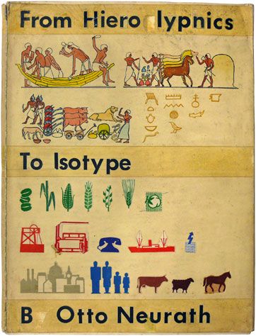
There were many attempts to create a universal symbolic language( Otto Neurath -Isotype)- So it could communicate to speakers of a number of tongues and language families equally effectively,even if the languages and cultures are completely different. Unfortunately no one succeeded. Cultures differ too much and might perceive objects, emotions and thoughts in opposed way. But particular symbols are being used daily.Pictographs can often transcend languages in that they can communicate to speakers of a number of tongues and language families equally effectively, even if the languages and cultures are completely different. This is why road signs and similar pictographic material are often applied as global standards expected to be understood by nearly all.


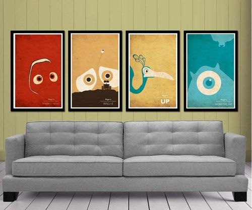
PIXAR Revolutions a.k.a. Animation from novelty to mainstream

  1. pixar

To explain the phenomenon of Pixar and how much it revolutionized the whole film industry and more, by creating 3D software and before that developing the computer image system,I need to start from the Crisis in Disney Studio. Animation had been dying a slow, strangulated death over the ten years before Pixar. Longer than that really. It sort of began to tail off when Walt Disney died. Crisis in Disney equals crisis in overall animation industry. Come to think of it, it’s quite funny that Animation Industry could have been extinct by now if Pixar studio never existed.

Disney made the decision to pursue a system that would allow animation drawings to be inked and painted in the computer instead of doing the work by hand on cells.They approached Pixar studio, newly set up by a group of former LucasFilm Computer Division employees. Together they developed software that handled the ”cell painting” image manipulation and film-making. The entire system ran on 21 Pixar Image Computers.Finally digital inking and painting was introduced to the world.- So first big steps of the Studio towards success were made: collaboration with Disney and following development of digital painting.

Another thing that led to success,was an exceptional investor, co-founder of Apple Inc.- Steve Jobs. Jobs being a visionary saw big potential in 3D and gave the Studio a nod to develop seemingly back then unthinkable 3D animation. It was Steve Jobs willingness to bet on that team as end of itself to support its ambitions to use those tools they have created in realizing it’s own creative vision-That would enable the group to fulfill its dream of becoming a movie company.

Pixar before making their first big feature film ,Toy Story’, to survive had been developing computer animation production system and their best product Pixar Image Computer. But the real milestone for the team was John Lasseter’s short movie for ‘SIGGRAPH’ called Luxo Jr. This short animation proved that  the medium of computer animation had advanced to the point where it could not only support a story but enhance it. It would become the first 3D computer -animated film ever to be animated for academy award.

Most apparent in its influences from Pixar is DreamWorks Animation. Their string of animated movies like the Shrek  series, Kung Fu Panda, and others has proved majorly successful for Paramount and DreamWorks.

What’s striking is that these developments go far past animated movies, and affect the majority of movies today. We now see movies like Star Wars featuring fully animated creatures interacting with people, and countless movies with CGI for the subtlest of purposes. Pixar seems to have pushed the industry in this direction of technology exploration and even beyond that. Its influence is massive.